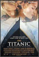
As it is shown here, the font the film 'Titanic' uses is quite bold and brass, maybe linking to use of the ship. Personally I do not think this would work for our film as I would like something more feminime.
 This font for 'P.S. I love you' is completely different to one from 'Titanic' and I prefer this one a lot more. It seems more feminime and would reflect the mood of the film through the font. The makers of 'P.S. I love you' have obviously used this font as it is about letter and this looks hand written linking to the theme of the film. The use of the colour red also gives the connotation of love and romance so this is something we should consider.
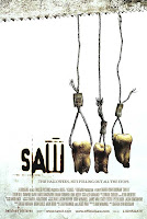
Contrasting to the Romantic genre I had been looking at is the font used by the 'Saw' films, the use of the dirty brown colour like that of dry blood show's what to expect in the film. Showing that the font used can reflect the genre of the film.
Our Fonts.
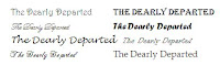
I have wrote the name of our film 'The Dearly Departed' in many different fonts - so have the other members of my group we will show eachother the fonts we have chosen and then compare them to see which ones we prefer.
These are the fonts I've provided:-
These are the fonts I've provided:-
 I will send another post showing which font we chose.
No comments:
Post a Comment